← Back
Sonder Studio
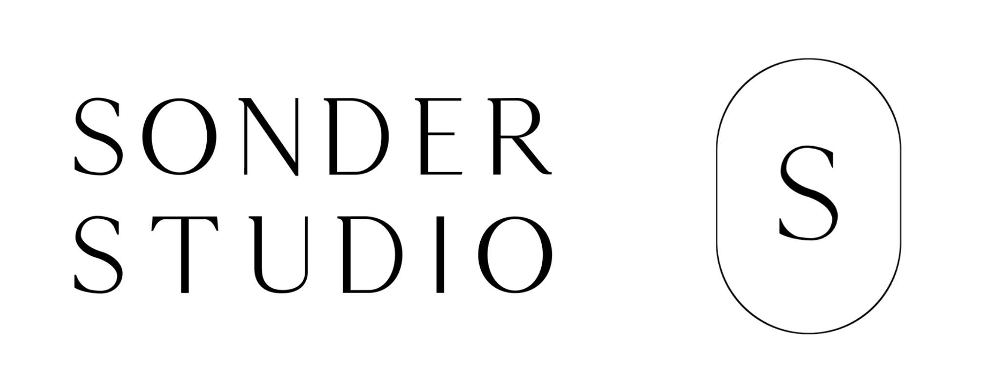
Behind the Brand Identity
Thin fonts with character were used for the brand logo to encapsulate the minimal feel and look of the brand. Thin lines frame the submark to retain a timeless and universal feel. Neutral brown hues and artichoke green form the brand colour palette.
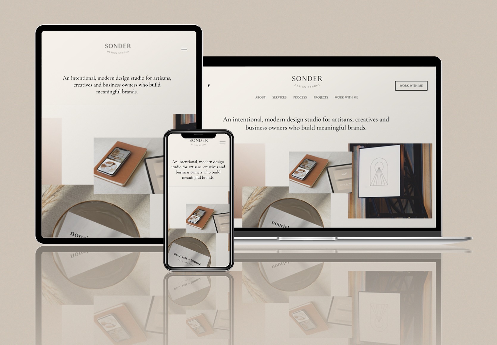
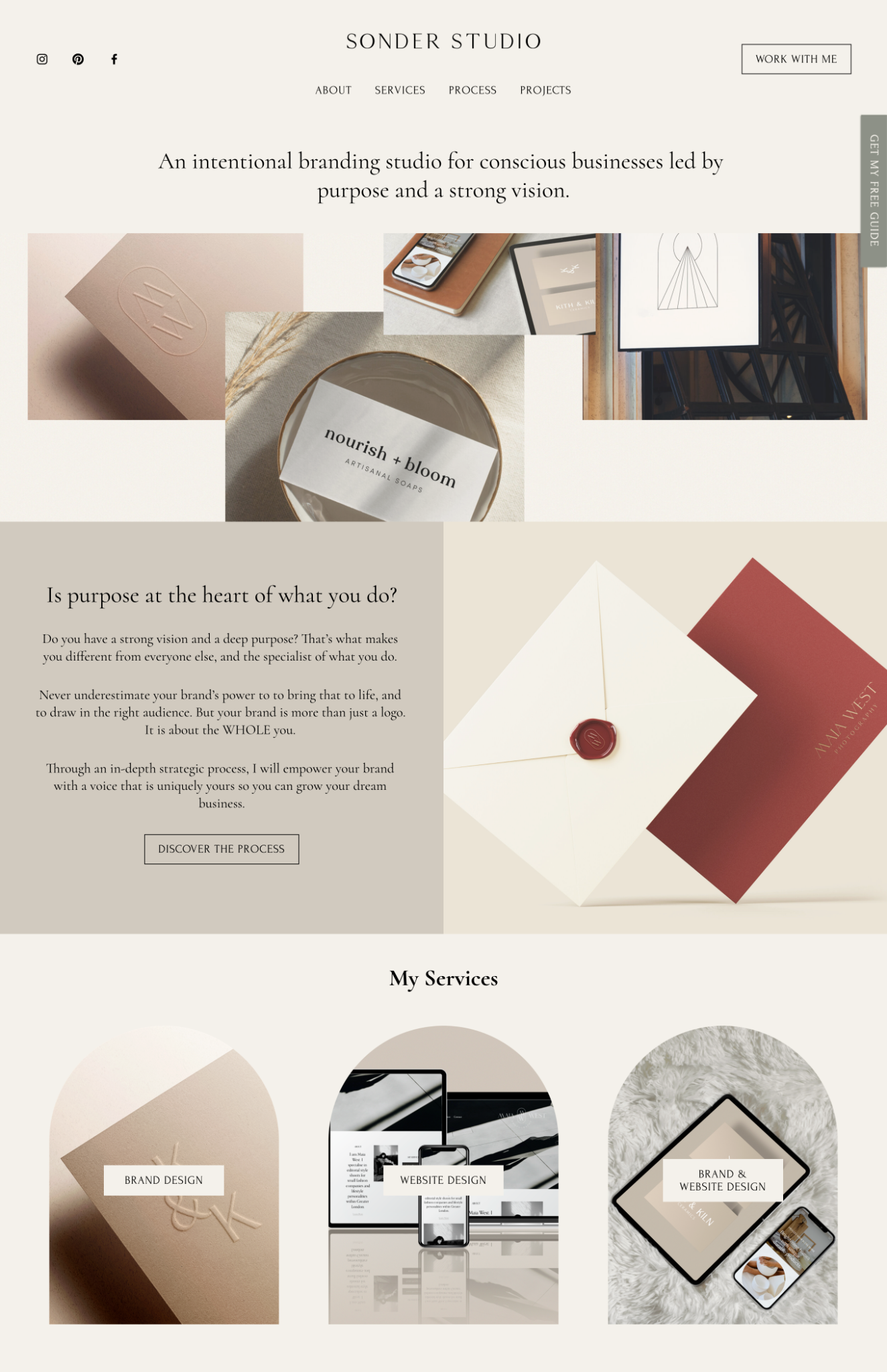
Behind the Website
This website was designed in May 2021 when I experimented with turning this side hustle full-time, rather than taking projects in on a referral basis. The design was kept in line with the brand identity - it was kept minimal, timeless and universal.
Post a comment