← Back
The Slow Melt
Client: The Slow Melt (2022)
Project: Brand Design & Packaging
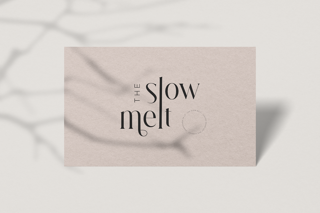
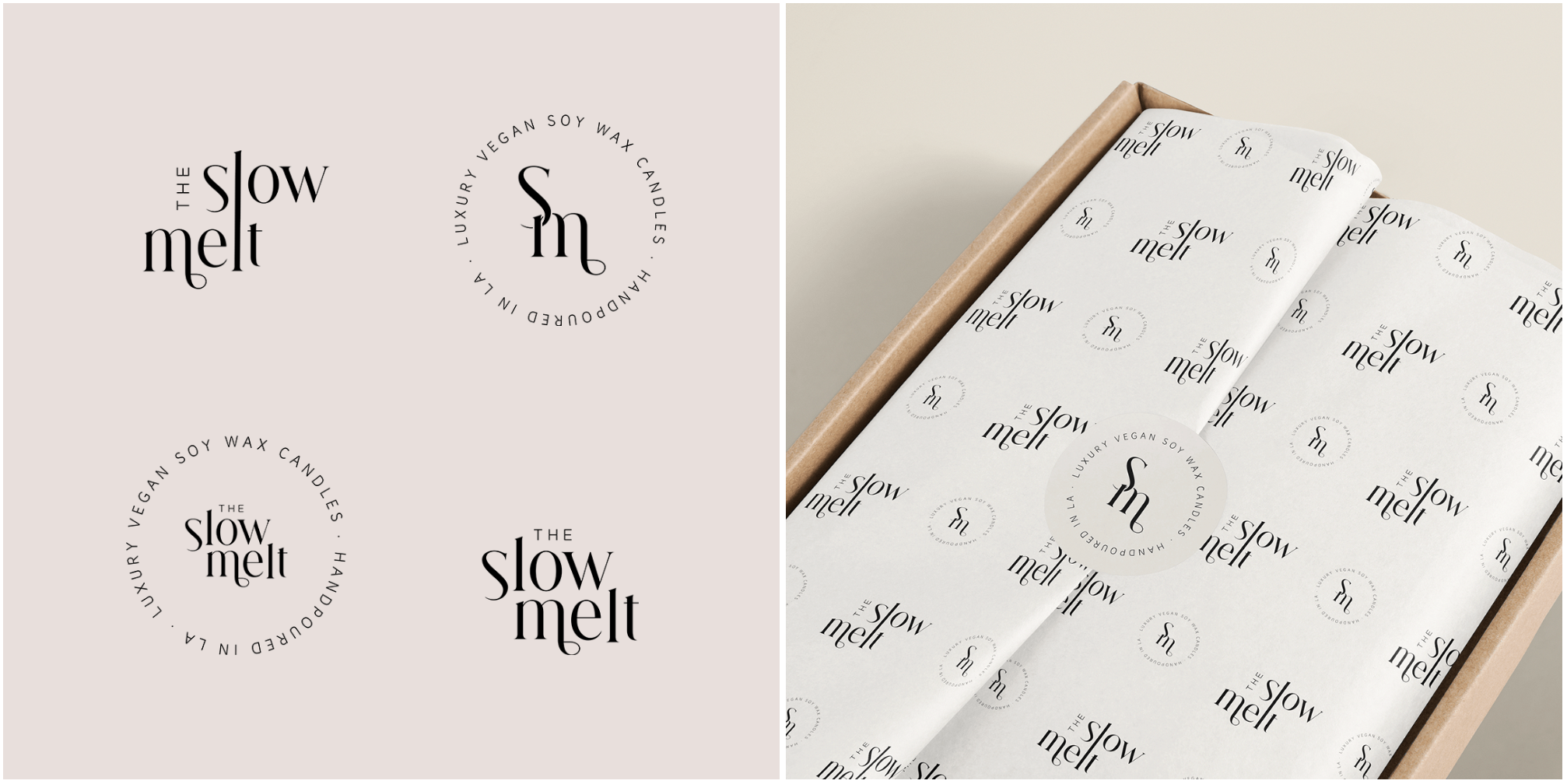
Kay was introduced by a former client, and when she approached me to brand her scented candle label, The Slow Melt, I was bursting with many strategic concepts to execute her brand’s creative direction. I experimented with the elements in the logo and decided to elongate the "L" to depict the slow, drawn out process of a candle melting, which is in line with the brand name. As Kay loved all things boho, I utilised a font that exuded a modern-boho feel while not compromising on a timeless look.
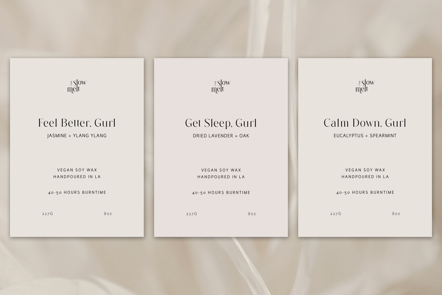
For the labels, Kay wanted something very clean and minimal, so I did away with the lines and boxed structures typically seen on candle labels, and went with generous whitespace.
Post a comment